I'm back. Yes, it's been a realllllll long while. Each time I thought about getting back to my blog, something else in my life happened, to keep me from it...from you. But, it would seem that the rain has stopped finally. And I'm ready now, more than ever to be back to blogging.
New me...new life...new apartment...new career...well you get it. I've put everything I needed to back together, and now...I'm really happy and ready to take on whatever life sends my way...well, except for rain...and maybe an IOU from the CA state tax board :)
So, soon I'll post pictures of my new apartment, that I've spent that last couple of weeks working to get everything moved in and looking good...and much more will come from there.
I hope all of you are well, and I look forward to your comments and posts (my blogger friends)!!!! and thank you so much for your comments while I was away....
It's good to be back...yeah!
Friday, March 20, 2009
Get lost...get found
Posted by
girl meets glamour
at
Friday, March 20, 2009
26
comments
![]()
Wednesday, September 10, 2008
New from Schumacher...
it's fall and that means new fabrics, new products, new things you must have and old things you must do away with (or cosmetically alter)...
which is why you might need some fresh new fabrics...but, have you checked out Schumacher's website lately, well their new fall collections are available for preview...
among them is a collection from Celerie Kemble, featuring some great graphic prints, a floral, and some solids as well...
I'm really excited about this one called Betwixt, esp. in this color: Spark/Ivory...it might just make it into my home this fall!!
Posted by
girl meets glamour
at
Wednesday, September 10, 2008
33
comments
![]()
Simple Beauty...
I am up to my ears in deadlines this week and probably the next...I haven't been this busy in a long time. But, with all this work I always find time for inspiration...
Simply Beauty, like this vignette, pulls me back and helps me remember not to neglect the areas of my home that require small scale style and a personal touch...
Image: House Beautiful/Oct. '07
Posted by
girl meets glamour
at
Wednesday, September 10, 2008
15
comments
![]()
Monday, September 8, 2008
Paneling to love...
This is one thing I wish we had in our home...paneling. I don't know why, but it just really speaks to me!! Whether it's new or not, there are so many ways to treat these walls! Of my favorite is the painted version, but done right all wood paneling can look fresh as well...
I fell in love with this house when I saw this room and it's unique paneling. I say unique because framed out in these panels are grass yoga mats!! Creating a very comfortable dining room, where without could be left a bit too formal.
This is my kind of wood paneling, Nate Berkus you've done it again!! I love the contemporary grid pattern and what looks to be the leather inlay!!
Go for a contrasting look and you'll make the right statement, this room is all about the paneling choice! Designer Garrow Kedigian used a black linen wallpaper here, but I'm sure a paint would do the trick if you're on a budget!
A more simple but affective approach is beadboard paneling, can have a modern feel, if you run it floor to ceiling with minimal moldings. But I love that designer Peter Dunham even thought to panel the door!! What a great place for more art!!
Posted by
girl meets glamour
at
Monday, September 08, 2008
19
comments
![]()
Thursday, August 28, 2008
See you next week!
Posted by
girl meets glamour
at
Thursday, August 28, 2008
10
comments
![]()
Wednesday, August 27, 2008
High style finds...on Etsy!
I was so excited when I heard about Kelly's shop High Street Market a few weeks back...which features little chic vintage finds at great prices even! So I've been frequenting every so often to see what's new in store, of which I am always excited and surprised, that I thought I'd feature a few items for you to check out...
Posted by
girl meets glamour
at
Wednesday, August 27, 2008
13
comments
![]()
Tuesday, August 26, 2008
Feeling blue...and red!
I think blue is one of the easiest colors to work with, I mean it pretty much goes with everything...but one of my all time favorite combos is pairing this color with red! One minute it's super sophisticated the next is simple and sweet. Here are some examples I found of these colors, that I thought I'd share with you...
Posted by
girl meets glamour
at
Tuesday, August 26, 2008
10
comments
![]()
Labels: Red and Blue accents, Red and Blue decor, Red and Blue homes
Monday, August 25, 2008
Just playing around...
So I spend the weekend unloading boxes, breaking down boxes, painting a few chairs from ebay (below), and playing around a bit with some of my unknowns...
which is this pair of chairs that I'm still trying to figure out what fabrics I like with them...unfortunately one of the chairs has an area of torn fabric so they have to be reupholstered, I guess that's what you get when you go ebay.
So, I'm toying with keeping the chair color still a pale yellow or maybe going wild with Alan Campbell's Zig Zag print in Brown...oh, and I purchased some ikat fabric from UzbekAlive shown above too, which I think will make some great lumbar pillows...
Posted by
girl meets glamour
at
Monday, August 25, 2008
8
comments
![]()
Thursday, August 21, 2008
Rugs for days...
Hot off the press...Patterson, Flynn & Martin, a boutique floorcovering company based out of New York, has just launched a new website featuring all they have to offer, in a searchable format!! I swear this is the future, having everything accessible at the click of a mouse, no more product binders taking up library space!
I was really impressed with the website and their products of course and here's just a few that caught my eye that I thought I'd share with you...

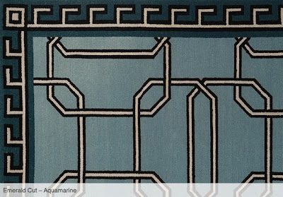
Oh and maybe you know that Kelly Wearstler designs rugs for PFM as well, shown above is one of them called Emerald Cut...
But there are so many more to choose from and patterns that offer various colorways as well!!!
Posted by
girl meets glamour
at
Thursday, August 21, 2008
5
comments
![]()
Tuesday, August 19, 2008
My new find...
Yup and I'm pretty fond of him thus far, and thought you ought to know! I'm thinking he is just what I needed for my house and that's probably I why I didn't bat an eye when I bought him a week ago in a little boutique.
Funny, right as I saw him I thought of blogger Courtney and her love for elephants too!
Posted by
girl meets glamour
at
Tuesday, August 19, 2008
9
comments
![]()
You know what they say...
and it's true in many ways, but it's what's on the inside that really counts when it comes you home....but you knew that already I'm sure!! But, when opening up my favorite magazines this month, I found this to be true in one particular way especially...Kitchen cabinets with colorful insides!!!
In House Beautiful, I feel in love with this coastal home...but the Kitchen especially, with it's white cabinets and aquamarine interior, adding depth and punch to the owner's collection of white dishes. I have a tall built-in cabinet in my Kitchen with glass, that I was planning on doing the same thing too!
Then this crimson red, which screams out against a once plain set of white cabinets in the Kitchen of designer Michael Bastian featured in Domino, caught my eye. Filled with with a "high-low cache of dollar-store champagne glasses, hand-me-down fine china and Tiffany candlesticks", a background that can make even missed matched collections come together!
Text exert from Alison Griffin/Domino Magazine
Posted by
girl meets glamour
at
Tuesday, August 19, 2008
10
comments
![]()
Friday, August 15, 2008
A retro redo in Bel Air...

In a 60's ranch style house, designer Molly Luetkemeyer transforms a home that hadn't been touched since it was built into a whole new world: "Paris in the 70's became the theme"...
With a bit of Hollywood Regency flair, here this Dining Room features a built in floating sideboard in a glossy orange and then the rest of the palette went from there...
Keeping the original marble fireplace in the Living Room, Molly reupholstered some of the existing vintage furniture left in the house, to make for a more stylish (less dated) vibe...

If you are not familiar with Molly or her company M.Design Interiors, above is an image from their office...um, can I work there!! But, you can check out the rest of their site for fun projects!
(Images vis California Home + Design/Sept. '08 and M.Design Interiors website)
Posted by
girl meets glamour
at
Friday, August 15, 2008
15
comments
![]()
Thursday, August 14, 2008
Materials girl...
(Image and text excerpt from Elle Decor/Christine Lennon/Sept. '08)
Posted by
girl meets glamour
at
Thursday, August 14, 2008
14
comments
![]()
Wednesday, August 13, 2008
Consider this combo...
consider new ways of using it, to keep it fresh! I've read some great posts on zebra rugs and their use, and we've all seen this rug in different settings...what comes to mind is the zebra rug over seagrass combo (seen alot of that)...but check out this image I found in my files, of a different pairing...
Posted by
girl meets glamour
at
Wednesday, August 13, 2008
11
comments
![]()
Tuesday, August 12, 2008
A bedroom trick...
Okay, not that kind...get your mind out of the gutter. I'm talking design trick in the bedroom...a switch up if you will, by taking that plain old headboard you're so bored of looking at, and changing the style around by draping fun textiles over it!
A seersucker headboard just so-so...but not nearly as exciting when Lee Jofa creative director Stephen Elrod draped a Indian rug over it...a rug, what a great idea!!
A subtle touch can do the trick too, here coarsely woven antique hemp fabric is laid over a finer white linen headboard...for a more bold statement I could see a pale yellow being used as well!
This doesn't have to just work with fabric headboards, above is Seagrass headboard (which can be found at Pottery Barn), makes a great statement doesn't it!?!

And not only a bedroom trick, but works just the same on a sofa, one of my favorites above from the home of Amanda Peet featured in Domino...
Posted by
girl meets glamour
at
Tuesday, August 12, 2008
7
comments
![]()
Monday, August 11, 2008
A few pieces just in...
and very worthy in my opinion, I'm just amazed at how many good finds on every website... Love this new ottoman at Horchow...in a fun leather and nail head design...this site seems to get better and better, and did you see their new Chesterfield sofa...

CBell has some new items on their latest page, of them I love this mirrored desk...
Posted by
girl meets glamour
at
Monday, August 11, 2008
8
comments
![]()
Thursday, August 7, 2008
Hollywood goes to Sydney...
in a meet up that channels a classic '60s Palm Spring vibe mixed with Modern day glamour, what is now called the "Ivy" in a once rundown Sydney spot is open for business... This hot new party spot features 18 bars, 9 restaurants, a swimming pools, and 2 rooftop penthouse suites...
 The lounge is backed full of bamboo chairs, marble tables, mirrored consoles, and loads of lush velvet drapes...
 Courtyards through out create an indoor outdoor feel with sunlight, plantery, and more lounging opportunities...
 Amidst the various outdoor areas, you can find spots too cool off with a shower (fit for several) like shown above...
 This place is bold with color and shapes, but just looking at this image I can tell all the detail that went into each piece, from the custom booth seating and tables, to the over-sized light fixtures above...I would love to dine here!!
Reminiscent of the "Viceroy" in some ways, I have no doubt that this joint is already a huge success...and now on my list of places to visit if I'm ever in Australia!!
*Images via Vogue Living/Photographer: Hugh Stewart
Posted by
girl meets glamour
at
Thursday, August 07, 2008
11
comments
![]()
Labels: Hollywood glamour, Ivy, Sydney
Wednesday, August 6, 2008
Blogger buzz...
Read all about, I was so happy to hear about Katie and her recent bio on 1st Dibs blogosphere, that I thought I'd spread the word to check it out...
Posted by
girl meets glamour
at
Wednesday, August 06, 2008
4
comments
![]()


