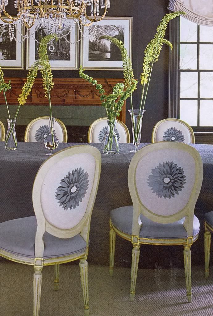
(Southern Accents/July/Aug. '08)
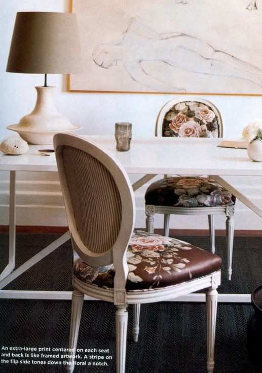
I mean you don't really have to pick a side, both sides are fine...but sometimes going with a bold print or switching fabrics on that back of a chair can really make the difference. This scenario is ideal in a Dining Room setting where the backs of the chairs are always on display...in my case, in our Family Room, I'm planning to do a few slipper chairs and switch up the fabrics on the backs since they face the entry...but really, it can be quite fun...so here's some inspiration for you!
(Elle Decor/March '08)
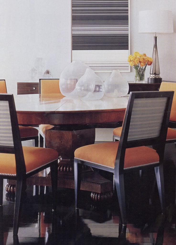
(Elle Decor/March '05)
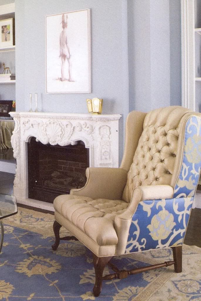
(California Home + Design/July '08)
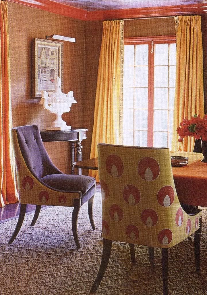
(Elle Decor/July/Aug. '08)
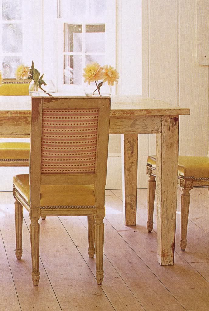
(House Beautiful/July '08)






21 comments:
Kate -- I remember that Elle Decor March 08 dining room. Loved the table mixed with that style chair :)
I love this idea--very neat!
I love that look. I saw Peter Fallico do that with grey tweed and hot pink once and it looked just as good as these pictures. Such a great idea, with the right chair!
What a great post! Thanks for sharing!
Such a great concept and a great detail to a room! BTW, love your new profile pic! Its so fun to put faces to blogs!
I read that this started in France where the main side had the exp fabric and the back side which wasn't seen had the cheap fabric, like a cotton check! I love the look of two fabrics! And that first picture - omg, wasn't that gorgeous?
I agree with you and the others- this is a great idea. And you found some beautiful inspiration images as well! Can't wait to see your chairs once they're finished!
I love this!! I think my jaw fell open when I saw that dining room in Southern Accents
i absolutely LOVE those last one! great selections. a friend of mine did something similar, but actually picked 4-5 different fabrics with similar colors and mixed 'em all up (front and back) on 8 different chairs. a very fun effect!
Thanks for all your comments, glad you liked this post!!
~Kate
I know, I did the same when I opened up this month's Southern Accents!!
~Kate
Brilliant Post Kate! I've been noticing many designers doing this and it it's very fun! I love the examples you chose here :)
YAY! I saw you mentioned in the Washington Post's blogger section today!
Thanks Alkemie and Fairfax!!
~Kate
Dear Kate,
Enjoyed your examples of what you can do with great fabrics and beautiful chair frames. Here's another example for you in this link to the Calico Corners current catalog:
http://www.calicocorners.com/text/content/e_catalogs/generic.htm
If interested, we could post that photo for your use, plus another that's also very pretty.
Jan Jessup, Calico Corners
jjessup@calicocorners.com
I love that white fireplace...so pretty. Lovely post ;)
I love the two shots from Elle Decore 08, gorgeous use of color.
What a good design idea. Reminds us to never any side for granted. Every view, side and corner of our furniture and rooms needs attention and creativity. Nice first photo.
This idea is so fun! I got the new southern accents and saw that dining room and tore it out to save!
I liked that story Domino did on the chintz,against my better memories of the 80's (we had navy chintz drapy curtains...yikes)
I saw this done by some designer or another at a showhouse in Atlanta...and I decided it was the perfect thing to do with the French chairs that I am going to get upholstered (some day...that project keeps getting pushed back).
Post a Comment