
Yup that's right...that's exactly what happened when I got my most recent Pottery Barn catalog. At first I said: "Ooooo, Pottery Barn's getttin' good these days. Might have to clear some room on my credit card...".
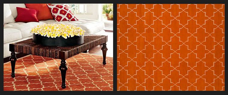
(Pottery Barn's Moorish Tile Rug on the left, Madeline Weinrib's Brooke Orange Rug on the right)
And then came the double take: "Hey...I've seen something really similar somewhere else...hmmmm." You know what they say, imitation is the sincerest form of flattery...and what do you think? If you were on the other end, would you be flattered??
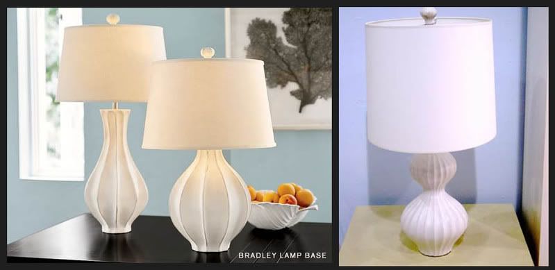
(Pottery Barn's Bradley Lamp on the left, Jonathan Adler's Nelson Lamp on the right)
In my opinion both these lamps have great style even if they are very similar...but maybe not similar in price...
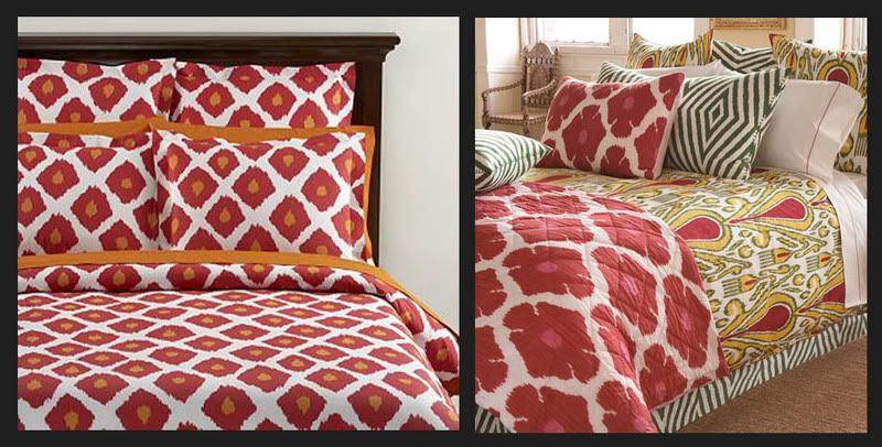
(Pottery Barn's Ikat collection on the left/John Robshaw's Bukhara collection on the right)
I love the colors in both of these, one with the pink accent and the other orange. Thinking about it though, over the past year of so Pottery Barn has really brought color and life back to their products and I really appreciate that even if there inspiration is easily noticed...


15 comments:
so funny... my post today was similar, talking about the CB2 catalog. i think all the big home retailers are reacting to the success of stores like target who have made design more accessible. by basically copying the look of all these high end designers, they are jumping on some hot trends. my only complaint is i wish they had done it sooner! now i'm kinda over the ikat and the moorish patterns... always looking for the next best thing! :)
Me too!! You have to stay ahead of the trends and once it's hit these places you know it's now mainstream.
~Kate
I commend pottery barn for finally staying with the trends but I agree, a bit to late! I do think that alot of America tends to be late in trends so it might work for home retailers advantage.
Those are pretty straight rip-offs. Maybe the original designers should do something about it. We could be looking at big money lawsuits here.
Well I would be plenty mad if I were the designer, but there is a market for both. There are plenty of people who can afford the original, and will pay for quality. Then there are people who have no clue as to where the design was lifted and are just thrilled to see something pretty they can afford.The issue I have is, are the original designs prices justified?Anyway, the designers are probably over those looks as well, looking for the next thing,like their savvy customers. They'll just make something new that you'll "have to have". I say keep them all on their toes by buying antiques and vintage. Where the hell does all that new stuff go when it doesn't sell?
Oh I love Pottery barn! I was getting ready to do a post on them in my blog!
I was really struck by the extreme similarity of the PB to the Robshaw.
I guess some people would argue that technically patterns like Bukhara or Wearstler's Imperial Trellis are heavily inspired by ethnic designs that have been around for centuries. But I think Robshaw and KWID really tweak them, make them feel contemporary, with color etc.
wow - I didn't realize this. thanks for pointing it out. Jonathan Adler has been ripped off everywhere, so. but Weinrib. BUT - you know get a web site girl! I want to buy your things, but how??????????
great post!!
i guess they all owe something to david hicks, hmmm?
the price point on the adler lamp isn't that high, so why not just get the real thing?
the sheets i understand a bit more- most people don't have the budget for robshaw, so the pb gives you that "feeling" without taking out a loan. still, the robshaw is SOOOOO much prettier i don't think i could live with the pb set (maybe in a child's room)...
todays designers all get "inspiration" from the past. Its actually comical that so many of you think that people like PB ripped off Jonathan Adler (and others) when in reality Jonathan Adler ripped off designers before him. The next time one of you sees a Hollywood regency designed room and coo's "Kelly Wearstler" you should google Dorothy Draper and really get inspired. These are not patented designs and no one should be crying law suits.
The lamps are both ripoffs of mid-century George Nelson fixtures. Everything gets recycled, it's just a different interpretation the next time around.
I see that kind of thing all over the place, I don't think it can be helped. but when you are in the design community, you know that by the time Pottery Barn has it, it is way old news, I do like that rug though...
I think Pottery Barn's new rip-off campaign is outrageous. I don't mind if they offer up something similar to the designer trends for the catalog market, but this is too close for comfort. I feel for the designers that work so hard to create something unique (even if it is built upon classic designs). It is one thing to revive a look from decades past, quite another to directly copy one currently on the market. Shame on PB!
I love Pottery Barn! Here's to affordable design chic!
Post a Comment